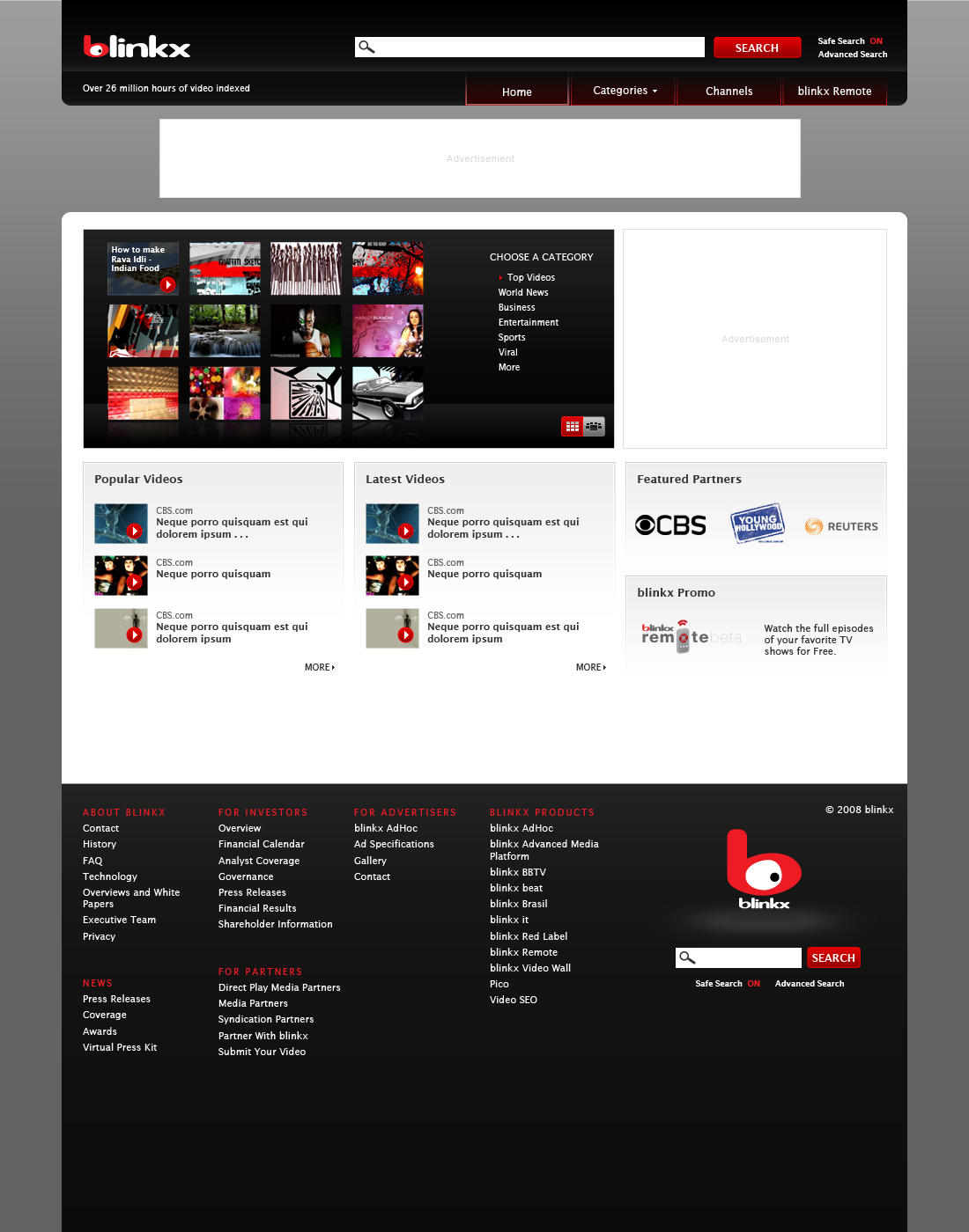
blinkx was a video search engine. The site allowed players to search for all the videos across the web. The front page featured a “Video Wall” that displayed the most popular videos, as well as links to other videos across the web.
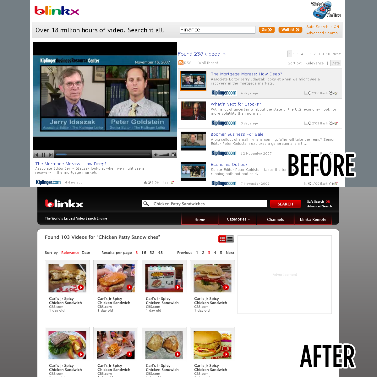
During my tenure, I found the blinkx homepage outdated, as well as visually cluttered. As a pet project I created aconcept for the redesign of the website. I took into account current web standards, such as designing above the fold.
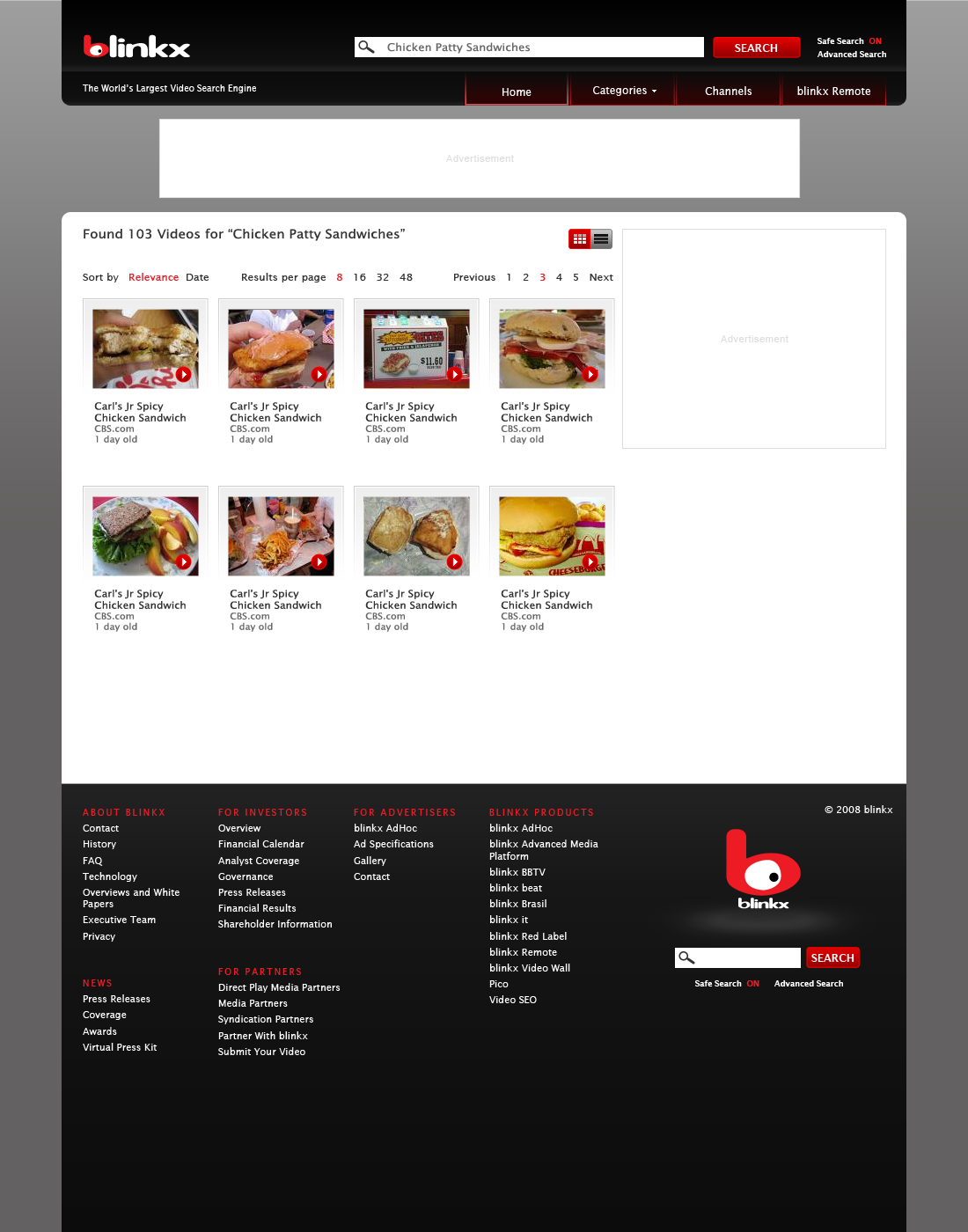
In my redesign I wanted to put more focus on the search bar, arguably the most important part of the website, as well as update the video wall. These components of the design have the most contrast to bring the users attention to them. In addition to highlighting the search bar, I also added channel and category navigation to the top so users could easily find videos that interested them. I made sure that my redesign was flexible enough to include space for ads, one of our main sources of revenue.
